Changelog
Changelog
Changelog
Every update we've shipped, and why it matters.
Sep 8, 2026
New Feature
Email Notifications.
Data refreshes, but nobody's monitoring the dashboard every second. Now we'll email you when your results update or a new feature ships, so you know when there's something worth logging in for.
You will be the first to know if something is shaking brand health.
August 7, 2026
New Feature
City-level trackers.
National numbers hide a lot. A brand that's dominant in one city can be invisible in another. Now you can run a Timelaps tracker at the city level, so you can measure exactly where your brand lives.
Useful for regional brands, retailers with a concentrated footprint, and national brands running city-level media or staged rollouts. Same dashboard, same methodology, scoped to the market you actually care about.
Available in every country we cover.

July 24, 2026
New Feature
Custom questions as filters.
Standard demographics only get you so far. Now you can turn any custom question into a filter, so you can cut the dashboard by the segments that actually matter to your business.
Loyalty members, app users, recent buyers, whatever you've added as a custom question can now be applied as a filter across every view. Set it up once at study level, and it behaves like any other filter: works on its own, combines with demographics, and saves per section.
The segments that describe your business rarely match the ones on a standard tracker. Now they don't have to.

July 10, 2026
Improvement
Sample size on hover.
Every metric sits on a base, and knowing that base matters when you're reading the number. Now hovering over a brand shows the sample size behind it, so you can sense-check any figure without leaving the chart.
Some metrics, like Advertising Recall and Word-of-Mouth, are calculated on aware respondents only. That base moves by brand because awareness itself moves. Hover over a brand to see exactly how many people that number is built on, without having to open the About panel just to check a base.
June 22, 2026
Improvement
Brand user filter on the funnel.
Funnel performance looks different when you cut it by who's actually using your brand. Now you can filter the funnel by brand user, so you can see how buyers move through your funnel versus everyone else.
Brand user was already a filter elsewhere in the dashboard, but not on the funnel views. Clients requested this improvement so we moved it up the roadmap.
June 8, 2026
New Feature
Wave-on-wave comparison.
A single snapshot tells you where you are. Comparing waves tells you whether things are working. Now every metric carries its history, so you can track movement from one wave to the next.
Metrics like awareness, consideration, usage, preference, association, and moments (category entry points) all move from one wave to the next. Pick any two waves and put them side by side to see what changed and by how much.

May 27, 2026
Improvement
Multi-language surveys.
Consumers answer in the language they think in. Now surveys run in any language while your dashboard stays in English, so nothing gets lost in translation.
Surveys can now run in any language the market needs, while the dashboard always displays in English. Field locally, read globally. One consistent view, no matter what language the data came from.

May 15, 2026
Improvement
Faster market setup.
Timelaps covers brand tracking for 82 markets globally. Adding a new market used to mean rebuilding from scratch. Now new market setup takes minutes.
We rebuilt the admin back end so country-specific data, including demographics, options, and defaults, can be set up and updated near instantly. That means we can onboard clients and set up their brand trackers in new countries, along with the insights, even faster than before.
May 11, 2026
New Feature
PowerPoint export.
Many client stakeholders prefer brand tracking insights in PPTs. It takes hours to download charts as images and format based on brand guidelines manually. Now PPT export takes just one click.
Download the full dashboard as a PPT presentation, formatted and ready to present. No more rebuilding charts by hand for the monthly readout.
Report history keeps every export you've made, so you can always go back and pull a previous one instead of regenerating it.

May 5, 2026
New Feature
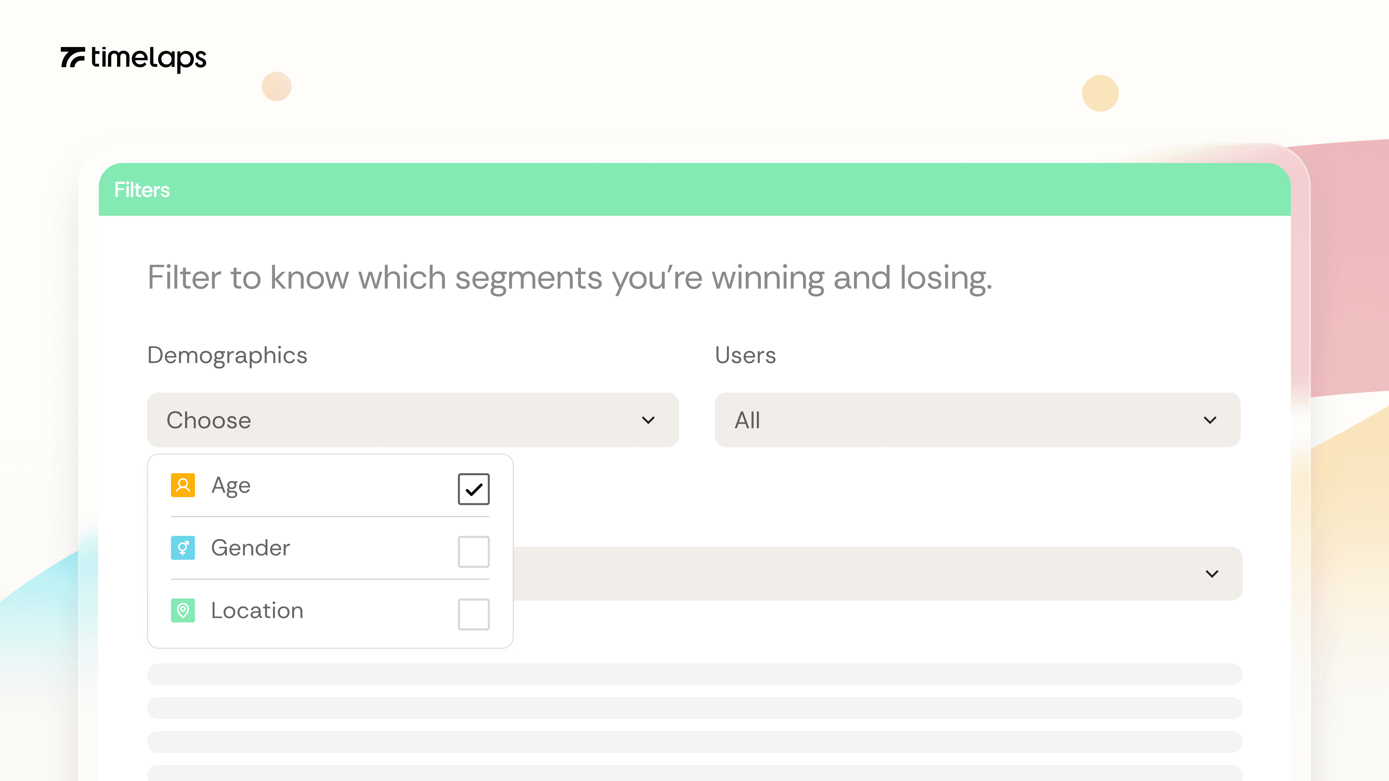
Filters.
Brand health rarely looks the same across every audience. Now you can cut any view by segment to see exactly where you're winning and where you're not.
You can filter by age, gender, income, region, brand usage, and decision style individually or in combination. Look at how you're performing with women 25 to 34 in your top region, compare that to men 35 to 49 elsewhere, or zoom in on any segment relevant to your business.
Filters can be set separately for each part of the dashboard, so you have the views you need.
April 30, 2026
Improvement
Brand fingerprint reorders by segment.
The biggest opportunity for one audience can be marginal for another. Now the Fingerprint re-ranks moments by size for your selected segment, so the shape of the curve always tells the right story.
The Brand Fingerprint shows how strongly a brand is linked to each buying moment in your category. Moments are ranked left to right by size, biggest moments first, so the shape of the curve tells you immediately where a brand is winning and where it's absent.
When you apply a filter, the order updates. The largest moments for that audience always sit on the left. A moment that's marginal in the full sample might be the biggest opportunity with 18 to 24s; you can now see that shift in the shape of the curve, not just the numbers.
April 27, 2026
Improvement
Smarter About panel.
A finding is only as trustworthy as the methodology behind it. Now every chart shows exactly what you're looking at and how it was measured.
The About panel pulls the actual survey questions used in your study, the filters currently applied, the wave, and both the filtered and full sample sizes. It updates dynamically as you change views.
So when you're presenting a finding or sense-checking a number, the methodology behind it is one click away, in plain language, with no need to dig into a separate document.
April 23, 2026
Improvement
Dynamic headers.
Filters change what you're looking at. Now headers change with them, so the context always travels with the view.
Apply a filter and every chart text header updates to reflect the data amongst that segment, so it's always clear whether you're looking at the full sample or a specific cut of it.
Small thing, but it removes a common source of confusion when sharing screenshots or walking someone through a finding.
April 16, 2026
New Feature
Custom questions.
Every brand has questions a standard tracker won't ask. Now you can add your own to any Timelaps study and see results alongside your standard modules.
Useful for the things specific to your business that a standard tracker won't ask about. Results appear in your dashboard next to the rest of your data, so there's no separate report to dig through.
Available in single-select and multi-select formats for now, with more question types on the way.
April 9, 2026
New Feature, AI
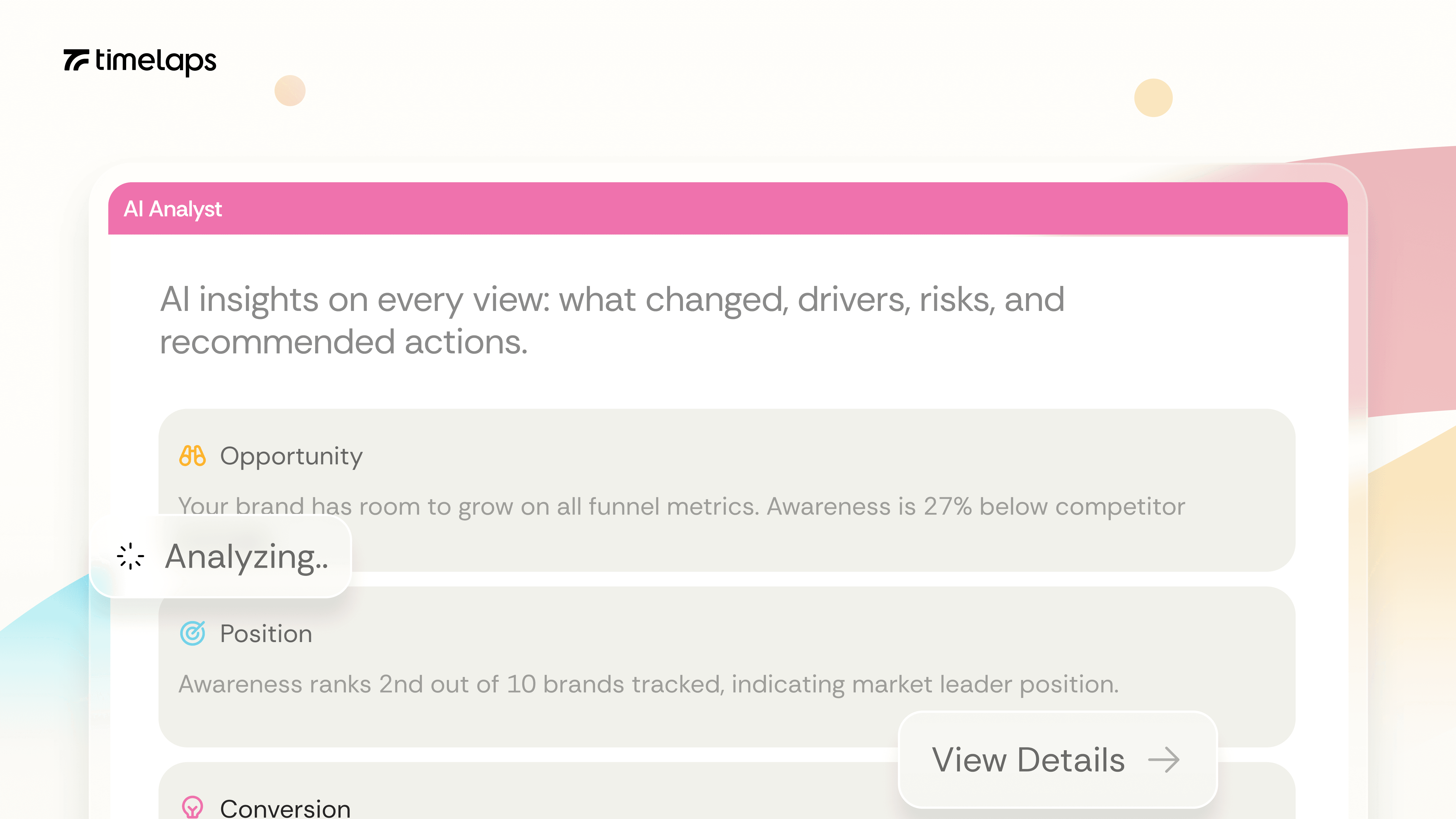
AI insights.
Reading a chart is easy; writing the read-out takes longer. Now every chart comes with one already written, in plain language, ready to share.
Every chart in the dashboard has an AI Insights panel that summarises what the data is showing. The headline pattern, the brands or moments worth paying attention to, and what's changed.
It's the kind of read-out you'd normally do yourself before sharing a chart with the team, written for you in plain language.
April 3, 2026
Improvement
Faster initial load.
Every second of load time chips away at the moment you actually want to act. Now Timelaps dashboards open noticeably faster, so you get straight to the insights.
Dashboards open noticeably faster on first load. Less waiting when you first land on a report or switch between studies.
Filter speed is the next thing on our list, and we're working on it.
April 1, 2026
Improvement
Onboarding email improvements.
The first email a new user receives sets the tone for everything after. Now you'll get much cleaner emails from us when setting up new accounts. Welcome :)
Small refinements to the emails new clients receive when their account is set up, including a clearer link in the post-signup email that shows you how to get back to the platform.
Minor on its own, but it removes a small friction point a few new users had flagged.
Sep 8, 2026
New Feature
Email Notifications.
Data refreshes, but nobody's monitoring the dashboard every second. Now we'll email you when your results update or a new feature ships, so you know when there's something worth logging in for.
You will be the first to know if something is shaking brand health.
August 7, 2026
New Feature
City-level trackers.
National numbers hide a lot. A brand that's dominant in one city can be invisible in another. Now you can run a Timelaps tracker at the city level, so you can measure exactly where your brand lives.
Useful for regional brands, retailers with a concentrated footprint, and national brands running city-level media or staged rollouts. Same dashboard, same methodology, scoped to the market you actually care about.
Available in every country we cover.
July 24, 2026
New Feature
Custom questions as filters.
Standard demographics only get you so far. Now you can turn any custom question into a filter, so you can cut the dashboard by the segments that actually matter to your business.
Loyalty members, app users, recent buyers, whatever you've added as a custom question can now be applied as a filter across every view. Set it up once at study level, and it behaves like any other filter: works on its own, combines with demographics, and saves per section.
The segments that describe your business rarely match the ones on a standard tracker. Now they don't have to.
July 10, 2026
Improvement
Sample size on hover.
Every metric sits on a base, and knowing that base matters when you're reading the number. Now hovering over a brand shows the sample size behind it, so you can sense-check any figure without leaving the chart.
Some metrics, like Advertising Recall and Word-of-Mouth, are calculated on aware respondents only. That base moves by brand because awareness itself moves. Hover over a brand to see exactly how many people that number is built on, without having to open the About panel just to check a base.
June 22, 2026
Improvement
Brand user filter on the funnel.
Funnel performance looks different when you cut it by who's actually using your brand. Now you can filter the funnel by brand user, so you can see how buyers move through your funnel versus everyone else.
Brand user was already a filter elsewhere in the dashboard, but not on the funnel views. Clients requested this improvement so we moved it up the roadmap.
June 8, 2026
New Feature
Wave-on-wave comparison.
A single snapshot tells you where you are. Comparing waves tells you whether things are working. Now every metric carries its history, so you can track movement from one wave to the next.
Metrics like awareness, consideration, usage, preference, association, and moments (category entry points) all move from one wave to the next. Pick any two waves and put them side by side to see what changed and by how much.
May 27, 2026
Improvement
Multi-language surveys.
Consumers answer in the language they think in. Now surveys run in any language while your dashboard stays in English, so nothing gets lost in translation.
Surveys can now run in any language the market needs, while the dashboard always displays in English. Field locally, read globally. One consistent view, no matter what language the data came from.
May 15, 2026
Improvement
Faster market setup.
Timelaps covers brand tracking for 82 markets globally. Adding a new market used to mean rebuilding from scratch. Now new market setup takes minutes.
We rebuilt the admin back end so country-specific data, including demographics, options, and defaults, can be set up and updated near instantly. That means we can onboard clients and set up their brand trackers in new countries, along with the insights, even faster than before.
May 11, 2026
New Feature
PowerPoint export.
Many client stakeholders prefer brand tracking insights in PPTs. It takes hours to download charts as images and format based on brand guidelines manually. Now PPT export takes just one click.
Download the full dashboard as a PPT presentation, formatted and ready to present. No more rebuilding charts by hand for the monthly readout.
Report history keeps every export you've made, so you can always go back and pull a previous one instead of regenerating it.
May 5, 2026
New Feature
Filters.
Brand health rarely looks the same across every audience. Now you can cut any view by segment to see exactly where you're winning and where you're not.
You can filter by age, gender, income, region, brand usage, and decision style individually or in combination. Look at how you're performing with women 25 to 34 in your top region, compare that to men 35 to 49 elsewhere, or zoom in on any segment relevant to your business.
Filters can be set separately for each part of the dashboard, so you have the views you need.
April 30, 2026
Improvement
Brand fingerprint reorders by segment.
The biggest opportunity for one audience can be marginal for another. Now the Fingerprint re-ranks moments by size for your selected segment, so the shape of the curve always tells the right story.
The Brand Fingerprint shows how strongly a brand is linked to each buying moment in your category. Moments are ranked left to right by size, biggest moments first, so the shape of the curve tells you immediately where a brand is winning and where it's absent.
When you apply a filter, the order updates. The largest moments for that audience always sit on the left. A moment that's marginal in the full sample might be the biggest opportunity with 18 to 24s; you can now see that shift in the shape of the curve, not just the numbers.
April 27, 2026
Improvement
Smarter About panel.
A finding is only as trustworthy as the methodology behind it. Now every chart shows exactly what you're looking at and how it was measured.
The About panel pulls the actual survey questions used in your study, the filters currently applied, the wave, and both the filtered and full sample sizes. It updates dynamically as you change views.
So when you're presenting a finding or sense-checking a number, the methodology behind it is one click away, in plain language, with no need to dig into a separate document.
April 23, 2026
Improvement
Dynamic headers.
Filters change what you're looking at. Now headers change with them, so the context always travels with the view.
Apply a filter and every chart text header updates to reflect the data amongst that segment, so it's always clear whether you're looking at the full sample or a specific cut of it.
Small thing, but it removes a common source of confusion when sharing screenshots or walking someone through a finding.
April 16, 2026
New Feature
Custom questions.
Every brand has questions a standard tracker won't ask. Now you can add your own to any Timelaps study and see results alongside your standard modules.
Useful for the things specific to your business that a standard tracker won't ask about. Results appear in your dashboard next to the rest of your data, so there's no separate report to dig through.
Available in single-select and multi-select formats for now, with more question types on the way.
April 9, 2026
New Feature, AI
AI insights.
Reading a chart is easy; writing the read-out takes longer. Now every chart comes with one already written, in plain language, ready to share.
Every chart in the dashboard has an AI Insights panel that summarises what the data is showing. The headline pattern, the brands or moments worth paying attention to, and what's changed.
It's the kind of read-out you'd normally do yourself before sharing a chart with the team, written for you in plain language.
April 3, 2026
Improvement
Faster initial load.
Every second of load time chips away at the moment you actually want to act. Now Timelaps dashboards open noticeably faster, so you get straight to the insights.
Dashboards open noticeably faster on first load. Less waiting when you first land on a report or switch between studies.
Filter speed is the next thing on our list, and we're working on it.
April 1, 2026
Improvement
Onboarding email improvements.
The first email a new user receives sets the tone for everything after. Now you'll get much cleaner emails from us when setting up new accounts. Welcome :)
Small refinements to the emails new clients receive when their account is set up, including a clearer link in the post-signup email that shows you how to get back to the platform.
Minor on its own, but it removes a small friction point a few new users had flagged.
Sep 8, 2026
New Feature
Email Notifications.
Data refreshes, but nobody's monitoring the dashboard every second. Now we'll email you when your results update or a new feature ships, so you know when there's something worth logging in for.
You will be the first to know if something is shaking brand health.
August 7, 2026
New Feature
City-level trackers.
National numbers hide a lot. A brand that's dominant in one city can be invisible in another. Now you can run a Timelaps tracker at the city level, so you can measure exactly where your brand lives.
Useful for regional brands, retailers with a concentrated footprint, and national brands running city-level media or staged rollouts. Same dashboard, same methodology, scoped to the market you actually care about.
Available in every country we cover.
July 24, 2026
New Feature
Custom questions as filters.
Standard demographics only get you so far. Now you can turn any custom question into a filter, so you can cut the dashboard by the segments that actually matter to your business.
Loyalty members, app users, recent buyers, whatever you've added as a custom question can now be applied as a filter across every view. Set it up once at study level, and it behaves like any other filter: works on its own, combines with demographics, and saves per section.
The segments that describe your business rarely match the ones on a standard tracker. Now they don't have to.
July 10, 2026
Improvement
Sample size on hover.
Every metric sits on a base, and knowing that base matters when you're reading the number. Now hovering over a brand shows the sample size behind it, so you can sense-check any figure without leaving the chart.
Some metrics, like Advertising Recall and Word-of-Mouth, are calculated on aware respondents only. That base moves by brand because awareness itself moves. Hover over a brand to see exactly how many people that number is built on, without having to open the About panel just to check a base.
June 22, 2026
Improvement
Brand user filter on the funnel.
Funnel performance looks different when you cut it by who's actually using your brand. Now you can filter the funnel by brand user, so you can see how buyers move through your funnel versus everyone else.
Brand user was already a filter elsewhere in the dashboard, but not on the funnel views. Clients requested this improvement so we moved it up the roadmap.
June 8, 2026
New Feature
Wave-on-wave comparison.
A single snapshot tells you where you are. Comparing waves tells you whether things are working. Now every metric carries its history, so you can track movement from one wave to the next.
Metrics like awareness, consideration, usage, preference, association, and moments (category entry points) all move from one wave to the next. Pick any two waves and put them side by side to see what changed and by how much.
May 27, 2026
Improvement
Multi-language surveys.
Consumers answer in the language they think in. Now surveys run in any language while your dashboard stays in English, so nothing gets lost in translation.
Surveys can now run in any language the market needs, while the dashboard always displays in English. Field locally, read globally. One consistent view, no matter what language the data came from.
May 15, 2026
Improvement
Faster market setup.
Timelaps covers brand tracking for 82 markets globally. Adding a new market used to mean rebuilding from scratch. Now new market setup takes minutes.
We rebuilt the admin back end so country-specific data, including demographics, options, and defaults, can be set up and updated near instantly. That means we can onboard clients and set up their brand trackers in new countries, along with the insights, even faster than before.
May 11, 2026
New Feature
PowerPoint export.
Many client stakeholders prefer brand tracking insights in PPTs. It takes hours to download charts as images and format based on brand guidelines manually. Now PPT export takes just one click.
Download the full dashboard as a PPT presentation, formatted and ready to present. No more rebuilding charts by hand for the monthly readout.
Report history keeps every export you've made, so you can always go back and pull a previous one instead of regenerating it.
May 5, 2026
New Feature
Filters.
Brand health rarely looks the same across every audience. Now you can cut any view by segment to see exactly where you're winning and where you're not.
You can filter by age, gender, income, region, brand usage, and decision style individually or in combination. Look at how you're performing with women 25 to 34 in your top region, compare that to men 35 to 49 elsewhere, or zoom in on any segment relevant to your business.
Filters can be set separately for each part of the dashboard, so you have the views you need.
April 30, 2026
Improvement
Brand fingerprint reorders by segment.
The biggest opportunity for one audience can be marginal for another. Now the Fingerprint re-ranks moments by size for your selected segment, so the shape of the curve always tells the right story.
The Brand Fingerprint shows how strongly a brand is linked to each buying moment in your category. Moments are ranked left to right by size, biggest moments first, so the shape of the curve tells you immediately where a brand is winning and where it's absent.
When you apply a filter, the order updates. The largest moments for that audience always sit on the left. A moment that's marginal in the full sample might be the biggest opportunity with 18 to 24s; you can now see that shift in the shape of the curve, not just the numbers.
April 27, 2026
Improvement
Smarter About panel.
A finding is only as trustworthy as the methodology behind it. Now every chart shows exactly what you're looking at and how it was measured.
The About panel pulls the actual survey questions used in your study, the filters currently applied, the wave, and both the filtered and full sample sizes. It updates dynamically as you change views.
So when you're presenting a finding or sense-checking a number, the methodology behind it is one click away, in plain language, with no need to dig into a separate document.
April 23, 2026
Improvement
Dynamic headers.
Filters change what you're looking at. Now headers change with them, so the context always travels with the view.
Apply a filter and every chart text header updates to reflect the data amongst that segment, so it's always clear whether you're looking at the full sample or a specific cut of it.
Small thing, but it removes a common source of confusion when sharing screenshots or walking someone through a finding.
April 16, 2026
New Feature
Custom questions.
Every brand has questions a standard tracker won't ask. Now you can add your own to any Timelaps study and see results alongside your standard modules.
Useful for the things specific to your business that a standard tracker won't ask about. Results appear in your dashboard next to the rest of your data, so there's no separate report to dig through.
Available in single-select and multi-select formats for now, with more question types on the way.
April 9, 2026
New Feature, AI
AI insights.
Reading a chart is easy; writing the read-out takes longer. Now every chart comes with one already written, in plain language, ready to share.
Every chart in the dashboard has an AI Insights panel that summarises what the data is showing. The headline pattern, the brands or moments worth paying attention to, and what's changed.
It's the kind of read-out you'd normally do yourself before sharing a chart with the team, written for you in plain language.
April 3, 2026
Improvement
Faster initial load.
Every second of load time chips away at the moment you actually want to act. Now Timelaps dashboards open noticeably faster, so you get straight to the insights.
Dashboards open noticeably faster on first load. Less waiting when you first land on a report or switch between studies.
Filter speed is the next thing on our list, and we're working on it.
April 1, 2026
Improvement
Onboarding email improvements.
The first email a new user receives sets the tone for everything after. Now you'll get much cleaner emails from us when setting up new accounts. Welcome :)
Small refinements to the emails new clients receive when their account is set up, including a clearer link in the post-signup email that shows you how to get back to the platform.
Minor on its own, but it removes a small friction point a few new users had flagged.